
Momentive: Idea Screening
The fastest way to test and validate multiple product and creative ideas.
Overview
As part of the typical testing process for new products or line extensions, market researchers will perform early-stage testing with many, low-fidelity concepts to see what ideas resonate most before deciding to further invest on a narrow set of concepts.
By offering a solution intended for idea screening, Momentive can expand their positioning within the concept testing lifecycle, increase repeat usage by catering to a stage that occurs more frequently, and address needs of customers who require a sequential monadic methodology.
Challenge
Customers need a way to validate which low-fidelity ideas perform best, before investing too much time and money in fleshing out ideas and Momentive’s existing solution doesn’t scale well to support these needs.
Opportunity
Expand Momentive’s positioning within the concept testing lifecycle, while increasing repeat usage by catering to a stage that occurs more frequently.
Results
$150,000 increase in annual revenue
350% increase in projects run per quarter
My role
User interface
User experience
Prototyping
User research and testing
Data visualization
Designing for AI/ML
Team
Sr. Product Designer
Greg Allen
Sr. Product Manager
Adam Di Tota
Sr. Engineering Manager
Tod Creasey
Staff Engineer
John Ho
UX Content Strategist
Liz Breckenridge
Staff Engineer
Justin Day
Sr. Software Engineer II
Taemoor Abbasi
Sr. Engineer Engineer I
Chigozie Eluolisa
Software Engineer I
Taylor Abraham
Discovery
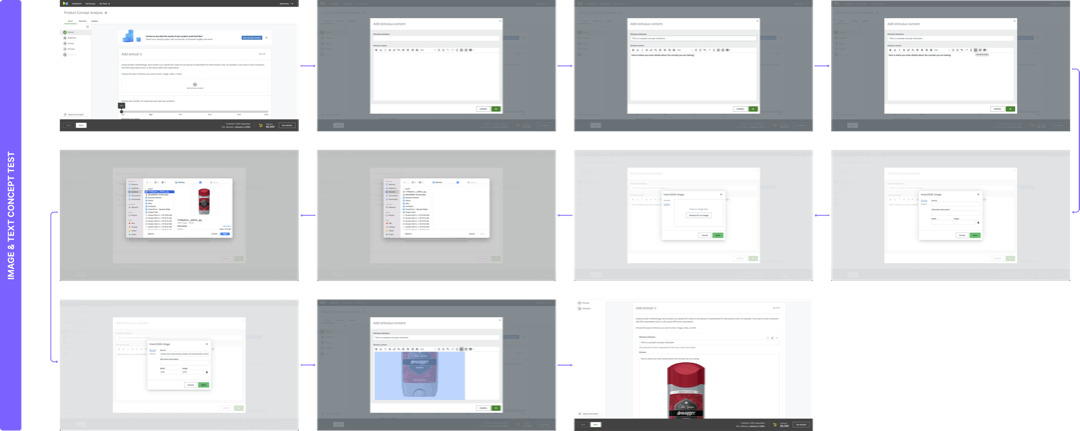
Adding content was painful
The concept testing suite was built to support testing up to 10 concepts, and the existing experience did not scale well beyond adding more than half a dozen due to the way adding content was implemented — the result was a lot of unnecessary friction that increased exponentially depending on the number of ideas tested. Visualizing the number of friction points throughout the flow helped me understand what areas could be optimized and aided in persuading the team to build a better user experience.

Difficult to navigate and make changes
Adding content was not only a painful process but also made it difficult for customers to navigate the page due to its length. Additionally, customers found it challenging to recall the location of specific concepts on the page.
Furthermore, the current user experience made a minor user error of uploading concepts in the incorrect order extremely painful. This mistake could be a highly distressing experience for the customer, requiring them to delete several concepts or begin the process all over again. Depending on the length and formatting of the content, this could result in the loss of work hours and missed deadlines. Improving the user experience would involve updating multiple testing modules outside the minimum viable product's scope.
—— The solution
Build on the existing suite’s UX while delivering a new methodology, data visualization, AI insights, and quality-of-life improvements that will benefit the whole concept testing ecosystem.
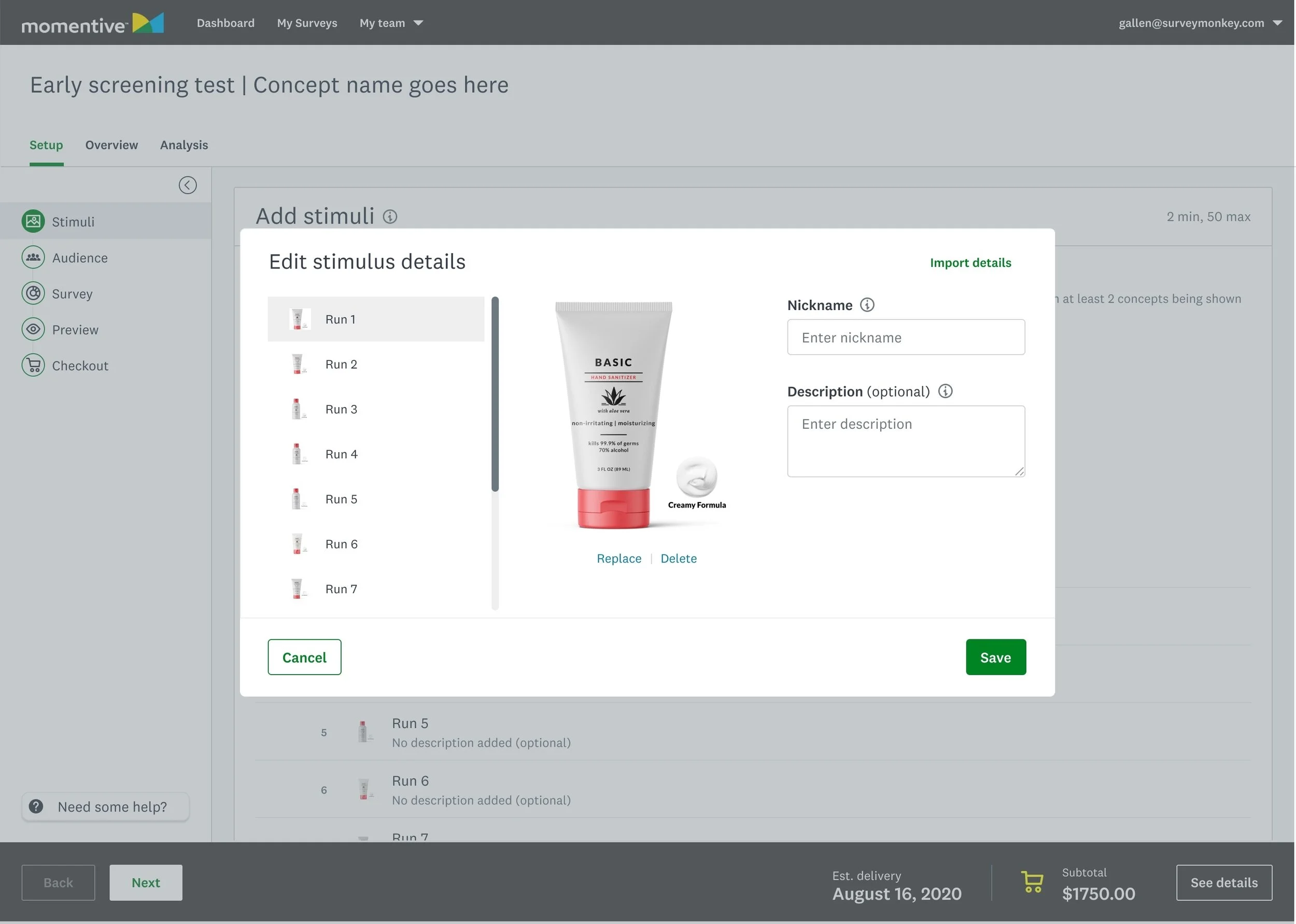
Streamlined UX for uploading and editing multiple text or image-based ideas
The initial version of Idea Screening had limitations in its functionality, such as not allowing the simultaneous uploading of multiple concepts or reordering them easily. Additionally, it required excessive scrolling which made it challenging for customers to add more than half a dozen ideas or make changes.
To overcome these challenges, I worked on creating new and improved features, such as upload and import flows based on the type of medium being tested. This resulted in a significant reduction of up to 81-99% in the number of clicks required to complete tasks, saving users 177-216 clicks for a maximum use-case of 20 ideas.
Moreover, the new list-based UI/UX design allows for in-line editing and re-ordering of ideas, which minimized the cost of addressing errors made by the user. The improved density also resulted in a 78% reduction in vertical scrolling. As a result, uploading and editing multiple ideas became a much more pleasant and efficient experience for customers, with significant improvements in task completion time.
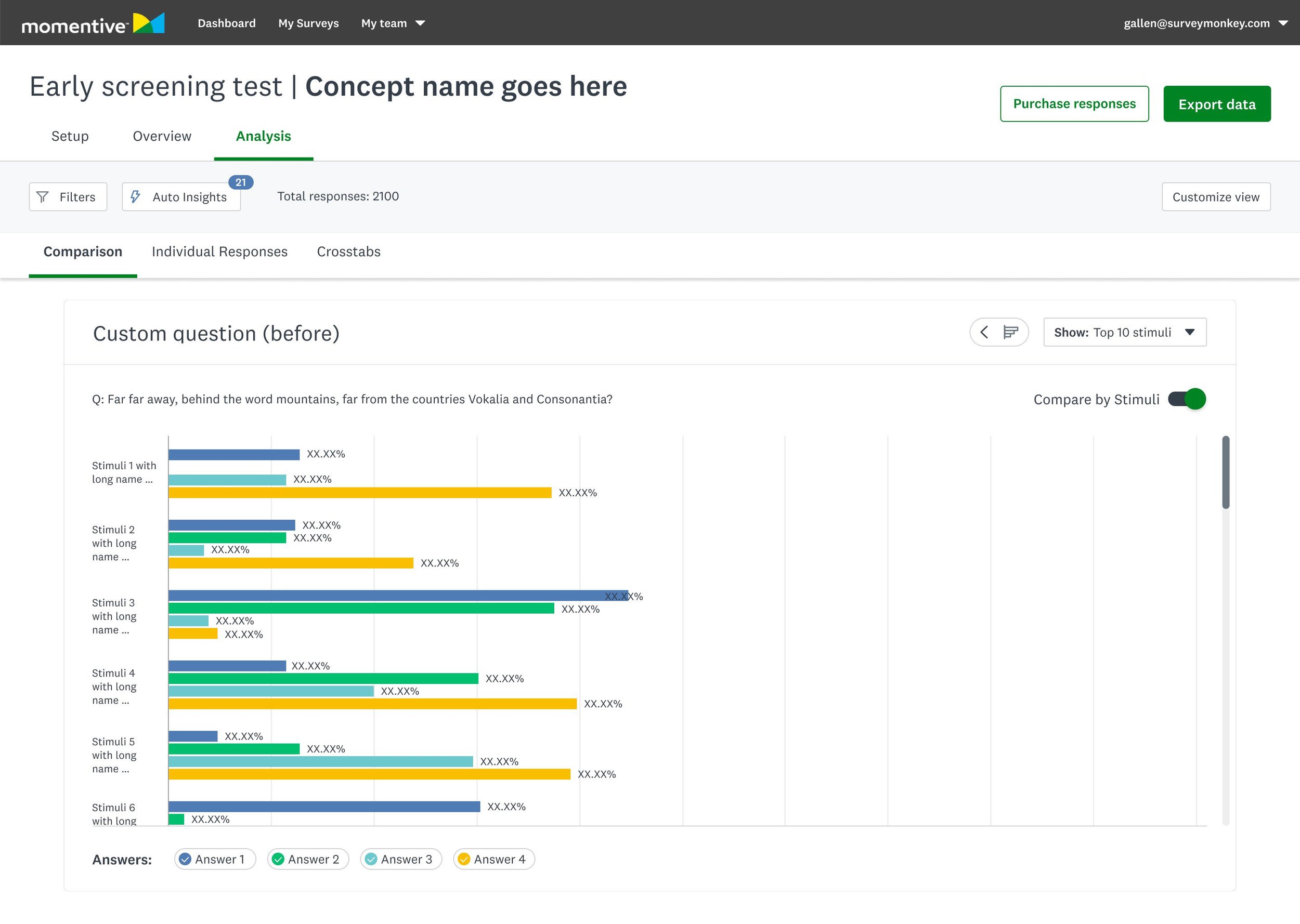
Enhanced data visualization
The existing charts made it difficult to compare more than a handful of concepts when you were measuring several attributes. The revised data visualization cards pictured here, support better density and allow for easier comparison across concepts and attributes.

Conversational AI powered insights
Momentive’s AI-powered insights had potential, but the initial version was not as helpful as it could have been. Based on customer feedback, we learned that they needed a more streamlined and organized approach to differentiate useful insights from noise, and they wanted to feel confident in the quality of the data.
In response to this feedback, we have made significant improvements to the design of our insights. We have adopted a list-based format that creates a more spacious and less cluttered appearance. Our customers can now view insights by score, attribute, or stimulus, or filter out irrelevant or underperforming stimuli. Furthermore, we worked closely with our ML team to modify the structure and language of the insights to make them easier to read.
With these changes, we are confident that our re-designed insights will provide our customers with more valuable and actionable information. We are excited to continue improving and evolving our technology to better meet the needs of our users.

Improved scalability of scorecards
One of the most compelling features of Concept testing was its scorecard, but we recognized that it had some limitations that needed to be addressed to support a more significant number of data points.
To improve the scalability of the scorecard, we changed to a listview pattern and swapped the axis. This change doubled the number of concepts that can be displayed and now better supports our customer's maximum use-case of 20 concepts. We also made it easier to compare concepts by allowing columns and rows to be reordered, giving customers the ability to group concepts by line or similar score.
In addition to these improvements, we introduced a rank order to increase the speed to insight. Customers can now see which concept scored highest overall based on statistical significance across all attributes. This will enable our customers to quickly and easily gain valuable insights and make data-driven decisions.