
Sleep Number: Navigation Design
Optimizing the path to purchase through improved wayfinding and support.
—— Project brief
In eCommerce the first level of product categories in navigation are consistently used by shoppers to infer the type of site they are on and the breadth and type of products the site carries. At the time, SleepNumber broke their navigation into verticals of Learn, Shop, Owners and Sale which obscured the types of products on offer and buried support.
In July of 2017 we kicked off a quarter long project to improve site navigation and taxonomy.
Goals
-
Increase product findability
Increase findability of top converting product categories
Increase trafficin lower visibility , higher converting categories
-
Improve search experience
Improve discoverability of search
Increase success rate of search
Reduce % of users that bounce immediately following a search
-
Improve support discovery
Increase the findability of support
Increase goal accomplishment by +X%
The team
-
Ji Rubalcava
Design Manager
-
Jake Flanagin
Product Manager
-
Nick Greene
Sr. Manager eCommerce
-
Graham Monteith
Front-end Lead
-
Aaron Solberg
Front-end Developer
My role
Research & competitive analysis
UI/UX
Information architecture
Prototyping
User testing
Interaction design
—— The problem
Users don’t understand the breadth of products on-hand and higher converting categories and sub-categories aren’t discoverable via site navigation.
Process
Discovery
I began the discovery phase with ethnographic research. A listening tour, where I connected with stakeholders from Product, Development and the Business to better understand the current state of navigation — user personas, KPIs, next-page-flow, seasonality, sitemap, A/B test capabilities and our goals.
After gaining a cohesive understanding of the problem I began an end-to-end heuristic review of our navigation UX. Supplementing my own findings with user testing verbatims and reviews it was clear that site navigation didn’t match up well with the user’s mental map for product categorization.

Next page flow report

Product traffic and conversion

What people are looking for

Areas of opportunity

Low support findability

Merging shop and learn paths

Global search

Loyalty program

Sleep Number - Site Navigation Legacy
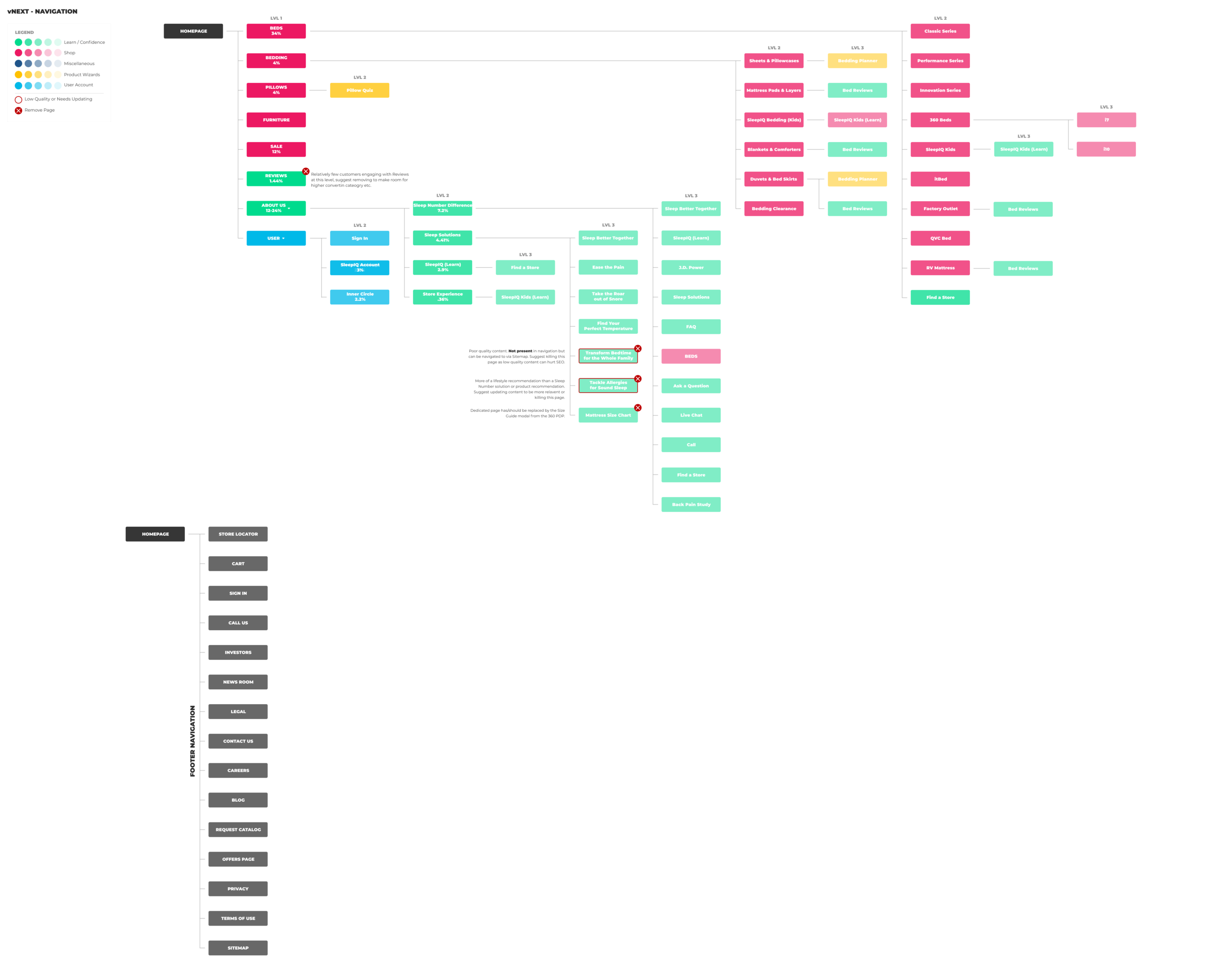
Sleep Number - Site Navigation vNext
Competitive analysis
Looking at direct competitors, eCommerce leaders and aspirational brand’s site structure it was clear there was a lot of opportunity to simplifiy and improve wayfinding, better highlight sales and new product offerings, and innovate a little within our problem space.
Supplementing my own research with findings from Baymard Institute’s latest eCommerce report, I presented the results of my discovery to the stakeholder group with the recommendation that among other things, we consolidate the learn and shop paths — treated as distinct personas — to better reflect how customers shop.
eCommerce
Usability leaders

Dropdown inspiration - usability leaders

Navigation inspiration - usability leaders


—— The results
We ran two paired back versions of our final recommendation in an A/B test against legacy nav as a control. Experiment A increased engagement in three key areas by 1-3% while remaining flat in other key action metrics.
Future growth experiments focussed on increasing awareness of financing would result in an estimated revenue increase of $250K.