
Momentive: Wrench Design System
Wrench is a multi-brand design system that aligns global teams with a standard design language to craft consistent, high-quality experiences across all products.
My role
User interface
User experience
Design system management
Documentation
Accessibility
Team
Sr. Product Designer
Greg Allen
Sr. Product Designer
Ramiro CHico
Sr. UI Designer
Marco Bakker
Sr. Manager
Melissa Clarke
Sr. Software Engineer
Matt Beaudry
Software Engineer I
Keara Bird
Sr. Software Engineer I
Wesley Nanjo
Engineering Manager
Andrew Herriot
Grid and more…
Wrench was already using a modified base 8 spacing scale but when the system migrated from Sketch to Figma, the team took the opportunity to revisit a few outliers — icons and typographic scale — as well as component size to support scaling components and interface elements to a variety of devices and screen densities.
This meant, auditing existing components, typography and iconography to uncover elements that did not align with the base 8 grid and make improvements as needed.
At the time I was working under the Market Research pillar but collaborated closely with the design system team as an individual contributor. I had proposed the shift to base 8 and would work on type scale improvements and consult on iconography usage and needs and help oversee the redrawing of the icon library and end up taking on redrawing many of the icons as well as creating new icons to support feature releases.


Typography
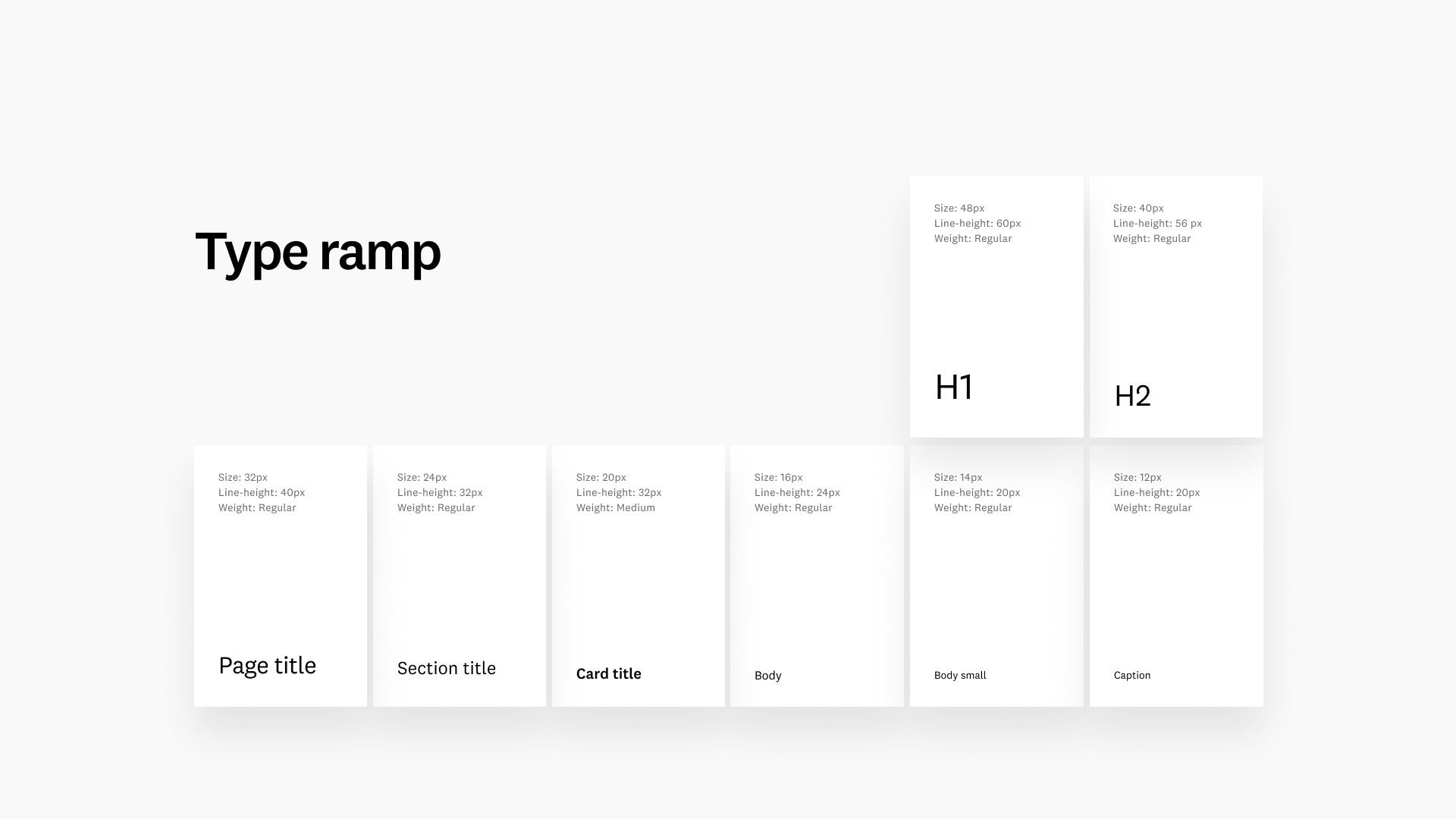
By switching to a base eight grid, the design team realized the current base 14 type scale was too small, lacked contrast, and caused legibility issues.
We faced a challenge in creating a consistent type scale across all our digital products. We decided to shift to a base 16 font size to create a more user-friendly experience. The new type scale allowed for larger text that was easy to read and improved our designs' overall aesthetics.
To start, I helped audit our products and solutions to understand the current type sizes and styles in use; this gave us a baseline understanding of what is being used and where. We conducted an audit of type usage across all products and solutions to see if there were any inconsistencies or areas of redundancy.
After auditing usage, we analyzed the data collected and identified several unnecessary type sizes and styles that were not being used or were being used in a limited capacity and recommended pruning out those styles.
I explored ratio-based type scales to incrementally increase the size of our text by a fixed ratio. This allowed us to create a visually pleasing rhythm and improved readability without deviating too much from our existing type scale — this ensured we didn’t introduce breaking changes.
Following my exploration, I landed on what I felt was a workable ratio of Major Third using a base size of 16. Still, the sizes weren’t cleanly divisible by 4 or 8, so I rounded up or down to the nearest neighbor to get a nice whole integer. Reviewing the proposal and aligning with the team on a few other potential paths forward, we invited designers to stress test the scale in their respective product areas to uncover further breaking changes.
After gathering feedback and further testing, we landed base 16 using a Major Third ratio as the solution to our typographic scale. We updated the design system documentation, and the team merged the changes into the Figma library and storybook.

Figma library
Throughout my tenure at Momentive, I contributed to the design system in various capacities. While under the Market Research pillar, I designed several new patterns, interaction paradigms, and components and partnered closely with the design system lead and engineers on improving existing WDS components.
After transitioning to the design systems team, I contributed directly to building and improving existing components within the library for both the Momentive and SurveyMonkey brands.
Components designed:
Chart changer
Chips
Data visualization cards
Data visualization footers
Operators
Badges
Local insights
Components improved:
Buttons
Checkboxes
Color system
Inputs
Modals
Multi-select
Progress circles
Radios
Selects (dropdowns)
Foundations improved:
Component states
Color system
Spacing
Typography
